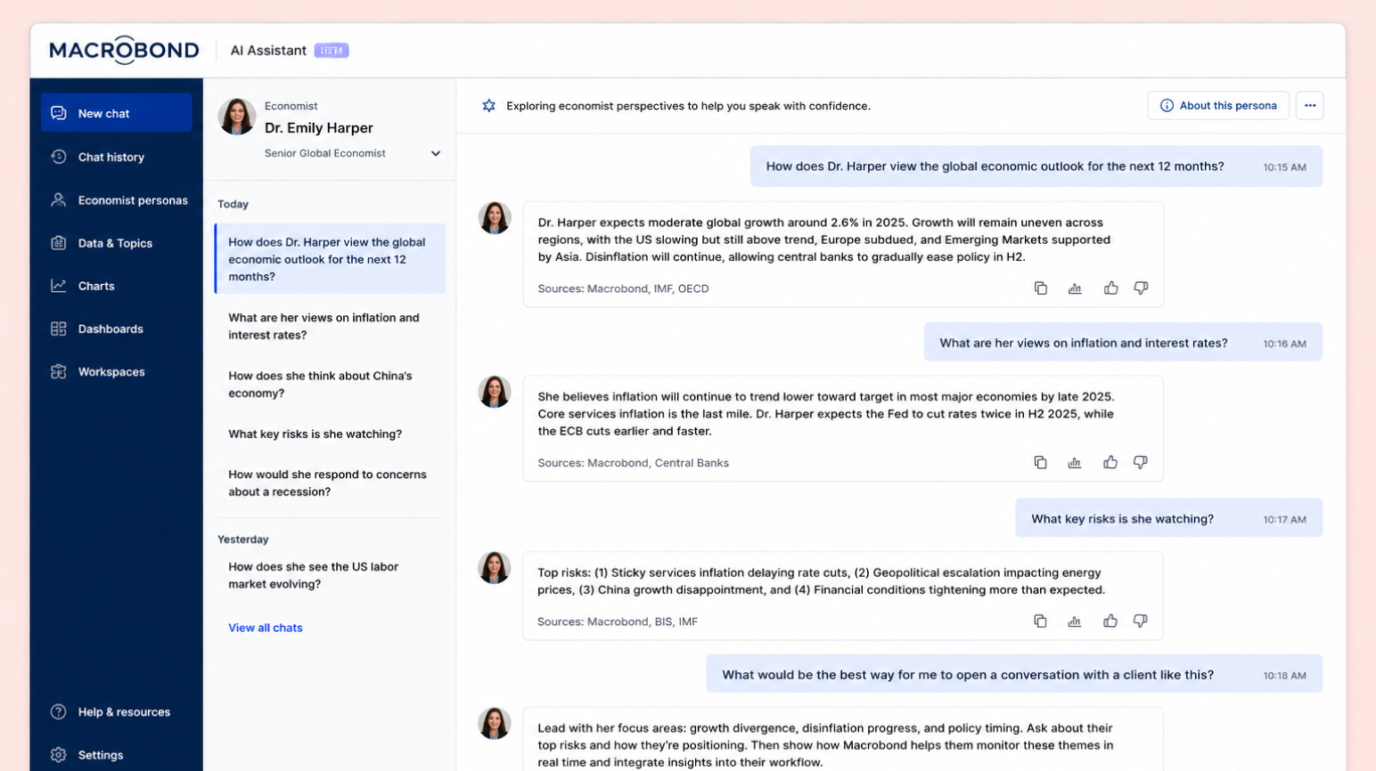
Customer research revealed that financial research creation is a fragmented, trust-dependent process — spanning multiple tools, involving heavy reliance on analyst judgement, and offering little transparency to end recipients.
Macrobond needed to solve for that trust gap while also finding a way to extend its footprint beyond existing customers and into the hands of their customers' customers.
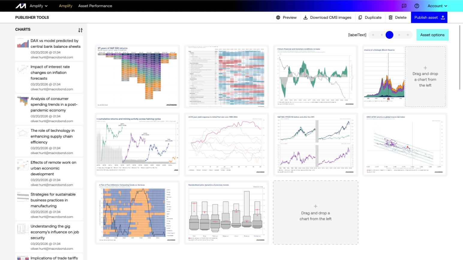
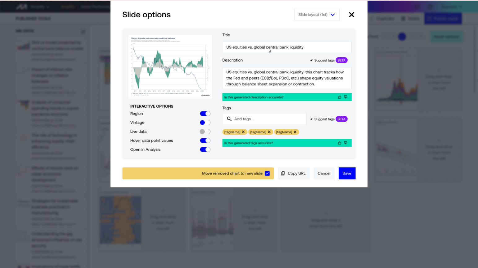
I led the full design effort from 0 to 1 — hands-on across user research, UX, UI and engineering collaboration. Recognising that Macrobond's unique position as both a data provider and analysis tool was the key differentiator, I shaped a platform that used existing data structures to make the analysis behind research transparent and interactive.
Alongside the product design, I created and now manage a brand new design system built to support Amplify and scale with future product development.
Working cross-functionally with Marketing on GTM strategy, Sales and Support on enablement, Finance on pricing, and Engineering on delivery, I brought the first iteration of Amplify to market from nothing. Early sales numbers are positive and customer feedback has been strong, with the team continuing to iterate.
Amplify represents a new product category for Macrobond — one that creates value not just for existing customers but for the audiences those customers serve
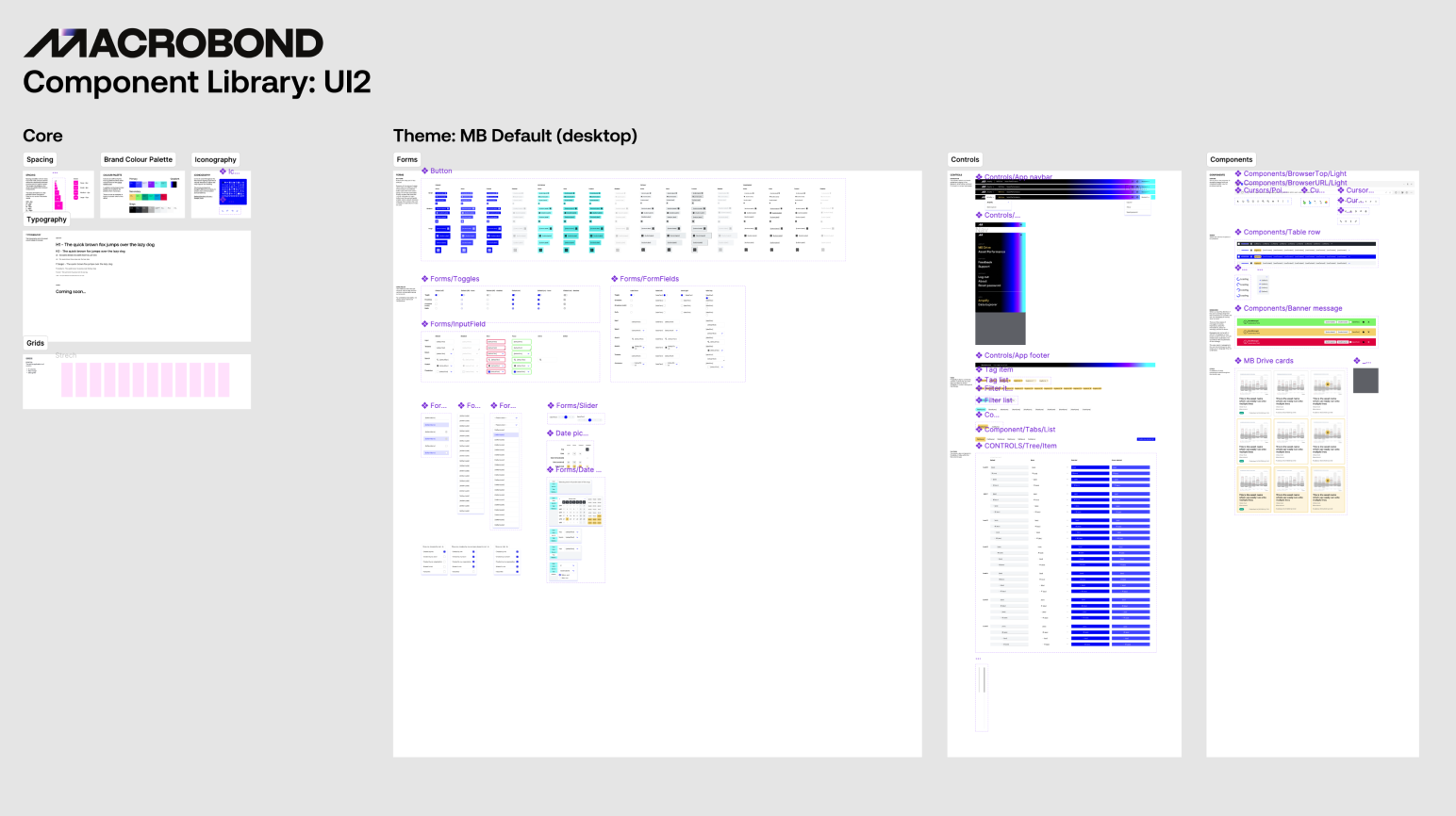
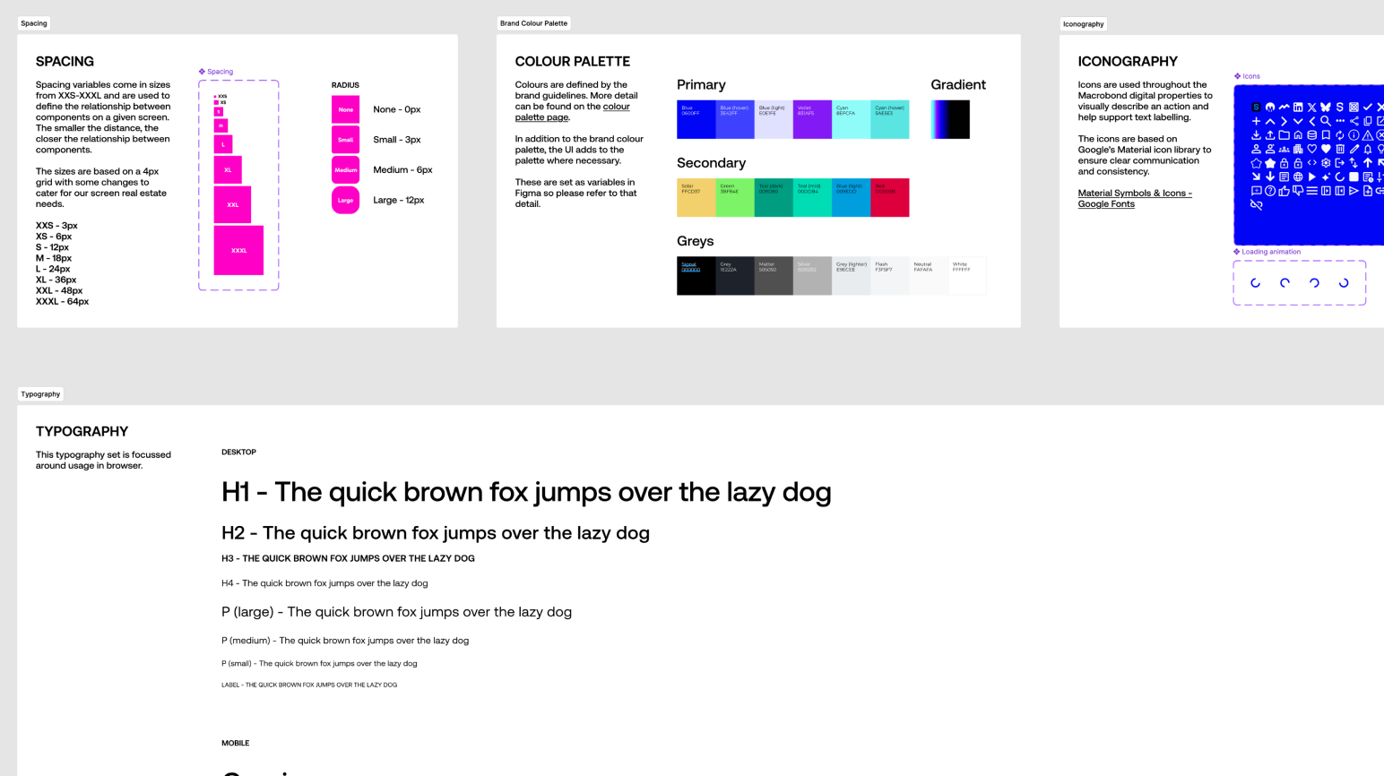
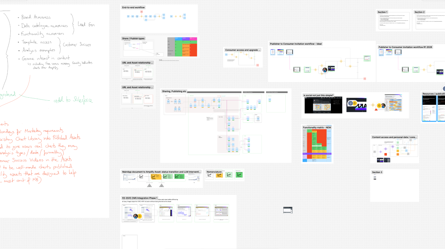
When Macrobond launched Amplify — a new product alongside a new company brand identity — there was no design system, no component library, and no shared language between design and engineering. Every decision was being made in isolation, which at the pace of a 0→1 build creates compounding inconsistency: buttons that don't match, spacing that drifts, colour usage that diverges from the brand. Without a system in place early, the debt accumulates fast and the cost of fixing it later is high.
The challenge wasn't just to build something — it was to build it quickly enough to be useful during active development, not after the fact.
I designed and built the Amplify design system in parallel with the product itself, treating it as a first-class deliverable rather than a post-launch tidying exercise.
The foundation was a comprehensive token architecture — colour, typography, spacing, elevation, breakpoints, and motion — built using Figma variables, giving the system a single source of truth that could propagate changes consistently across every component and screen.
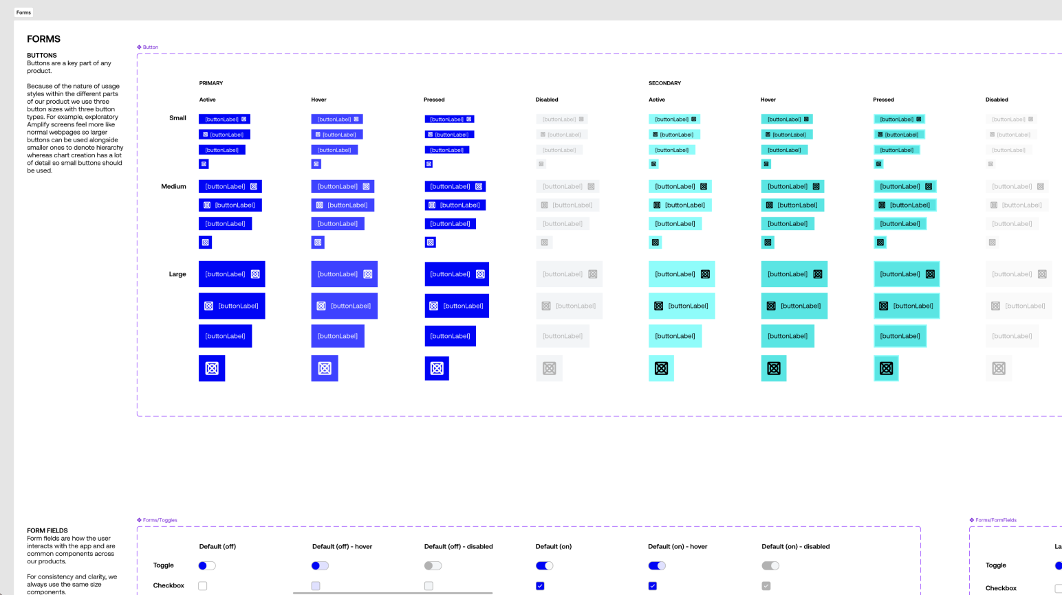
On top of that I built a component library of 60+ components, each designed to cover the full range of states, variants, and responsive behaviours needed across Amplify's data-dense interface. Every component was documented with usage guidance to make engineering handoff unambiguous and reduce the back-and-forth that slows down delivery.
The system was designed to be legible beyond the design team. Engineers used it as their implementation reference, building directly from the component specifications. PMs used it as a prototyping toolkit — with a well-structured library available, AI-assisted prototyping became a viable part of their workflow without requiring design resource for every exploratory iteration.
Within three months of starting from nothing, Amplify had a fully operational design system underpinning the entire product. Engineers had a reliable reference that reduced interpretation errors and the design-related bug count reaching production fell measurably. Designers could move faster knowing changes made at token level propagated correctly. PMs gained autonomy to prototype and explore without creating inconsistency.
The system continues to evolve as Amplify grows — but the architectural decisions made early have meant that scaling it has been additive rather than remedial.
As Macrobond worked through a significant business restructure, it became clear that there was no shared understanding of who the target customers actually were. Different teams were operating from different assumptions: Sales needed clear conversation frameworks for outreach, Marketing needed to understand how to speak to the wider community, and Product needed to understand how customers actually used their tools in order to optimise the experience.
Without a single source of truth, alignment across the business was difficult.
I led a structured three-phase programme to fix that. Phase one used AI to generate a comprehensive set of baseline personas and segments at scale — creating a foundation we could test and iterate on quickly.
Phase two went deeper, using AI again to enrich and interrogate those personas in detail. Phase three was about validation — pressure-testing the documentation with internal subject matter experts, then going out to a wide range of real customers to surface nuance and find where the assumptions broke down.
I was hands-on throughout: leading interviews, synthesising findings and shaping the final outputs into a full, rounded persona and segmentation suite.
The resulting documents are now actively used across Sales, Marketing and Product — informing everything from outreach talking points to product decisions. Taking the work further, I converted the persona outputs into an LLM-powered internal agent tool, giving teams the ability to query customer insight dynamically rather than just reference a static document.
This led to sharper Sales decks, better customer conversations in Support, and a stronger evidence base for the Product team.
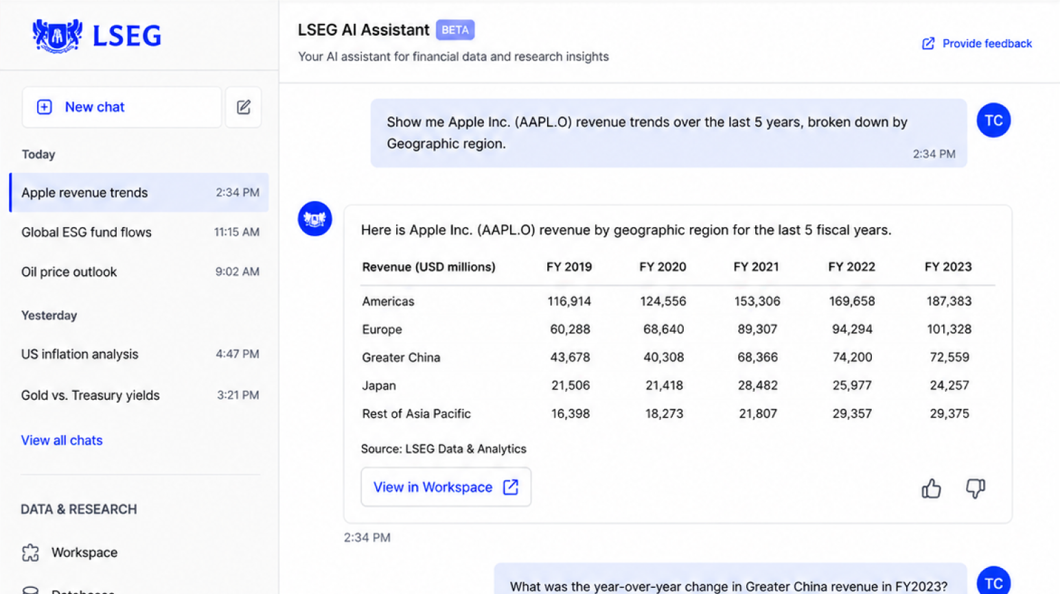
Research showed that financial professionals were increasingly turning to LLMs to support their research and analytics workflows. LSEG had a significant opportunity to lean into that behaviour using their extensive dataset library — but the challenge was designing an AI experience that felt trustworthy in a regulated, high-stakes environment.
The question wasn't just how to build a chat interface, but how to make AI-generated financial insight feel verifiable and credible enough for professional use.
Working hands-on alongside Engineering and Data Science, I designed LSEG's first LLM interface — creating a familiar chat-based experience that allowed users to interact naturally with datasets and research documents. Beyond the interface itself, I defined the tone of voice for the AI and led the work of training the model to produce outputs that gave clear data lineage.
That transparency — showing users exactly where the insight came from so they could validate it themselves — was the central design challenge and the key to building the trust the product needed to succeed.
The prototype was well received by both the Analytics and Platform teams internally, and performed strongly in customer beta testing. Findings were synthesised, socialised across the business, and used as the foundation for rolling AI capability into the wider LSEG platform.
Critically, the project didn't stop there — it directly catalysed a broader wave of AI initiatives across the organisation, demonstrating the strategic value of getting the first experience right.
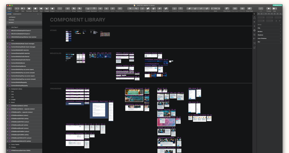
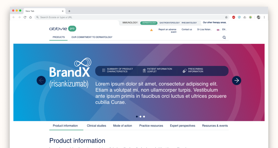
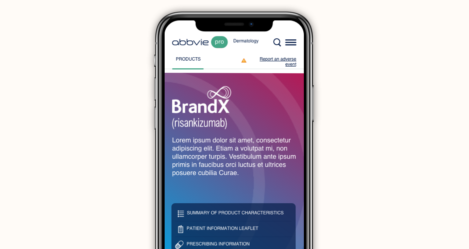
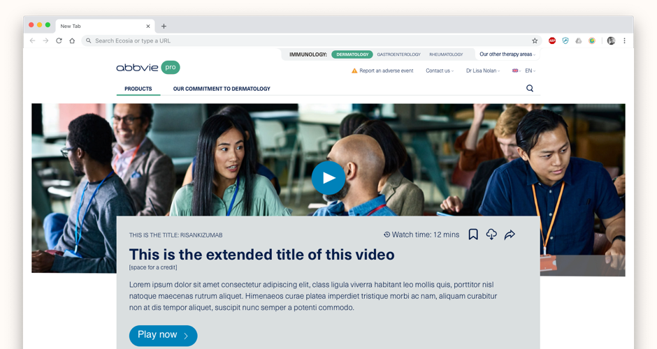
AbbVie's marketing had grown country by country, resulting in a patchwork of inconsistent drug marketing websites across the globe. Every country had its own visual language, content structure, and marketing interpretation. On top of the brand and consistency problem, each country has different regulations governing how pharmaceuticals can be marketed — meaning any design system had to be flexible enough to accommodate local legal requirements while maintaining global coherence.
I started with a detailed audit of every existing drug microsite — cataloguing common and unique journeys, content types, and user flows across markets. Qualitative interviews with marketing representatives from across the globe helped rationalise the content requirements down to what was genuinely necessary. From that foundation I designed a universal information architecture that housed common content while leaving room for market-specific customisation. The design system itself was built in Sketch using a master library — atoms feeding molecules, molecules feeding organisms, organisms feeding page templates — so any update to a base element rippled through automatically. The system was tested with marketing teams and healthcare professionals across regional microsites before sign-off.
AbbVie went from a governance nightmare to a system that regional teams could use to build consistent, compliant microsites — without needing central design resource for every new market launch.
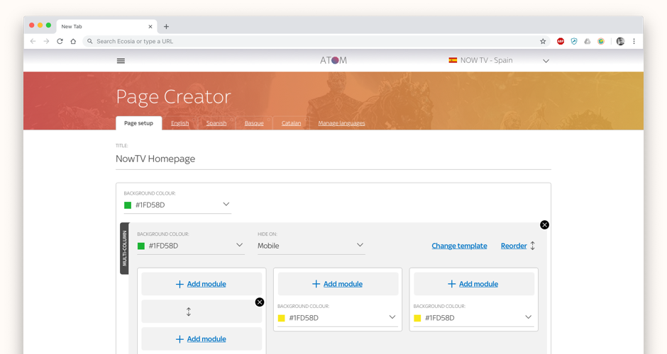
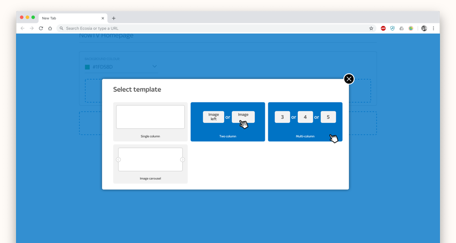
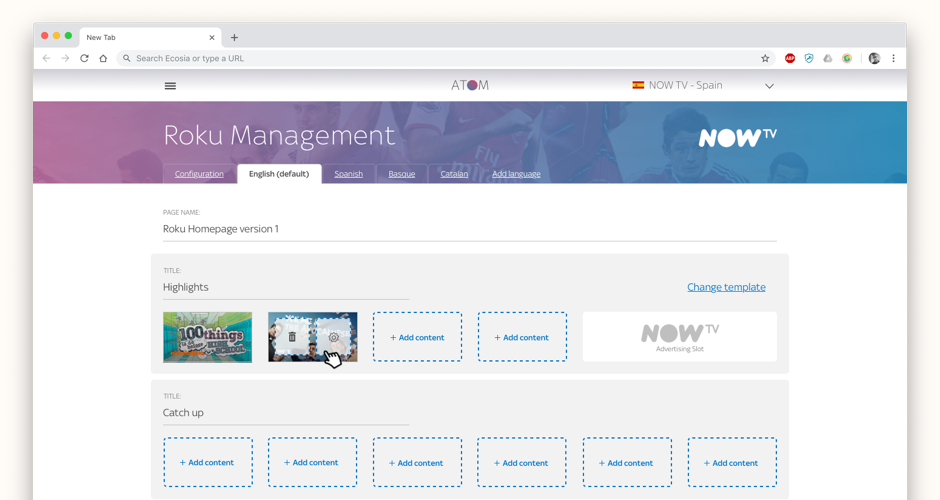
As Sky expanded internationally, the number of separate content management systems being used across the business had become unmanageable. Each territory, each team, each product type had its own tool — creating inconsistency, duplication, and significant operational overhead. Sky needed a single platform that could serve the full breadth of its business.
Working as part of a two-person UX team, I led the art direction and UI design for Atom, Sky's centralised CMS. The product needed to work across many different departments and use cases — from editorial content management to component-based page creation and A/B testing — while staying simple enough for non-technical users. I moved between creating the visual design language and producing wireframes and prototypes to describe journeys and processes, always grounded in ongoing research with real users from across Sky's businesses. Key features included component-based page creation, flexible template selection, built-in A/B testing, and a specialised interface for the NowTV box.
Atom gave Sky a single platform to manage content across international territories and multiple product surfaces — replacing the fragmented ecosystem with something coherent, maintainable, and designed around how editorial teams actually work.
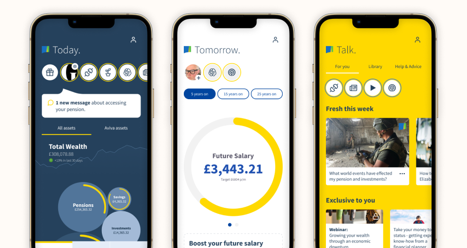
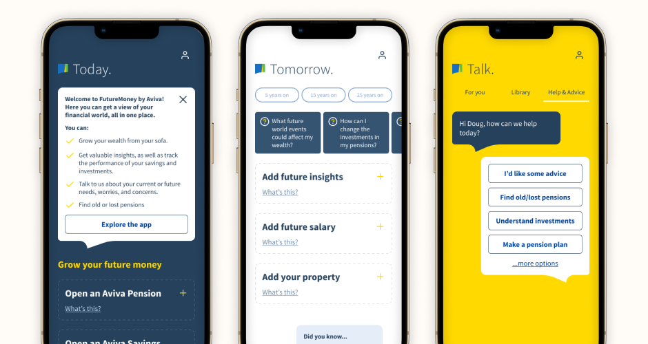
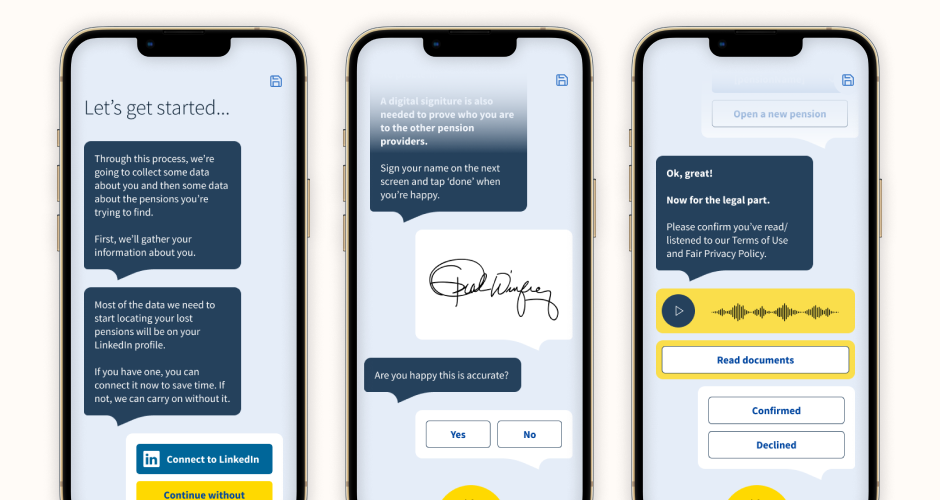
Research showed that people had been trained by financial institutions to treat banking as transactional — going wherever the best rate was, holding products across multiple providers, and avoiding thinking about the bigger picture. The 'head in the sand' mentality was real and widespread. Aviva wanted to change that dynamic by becoming the brand that held a customer's entire financial world.
I designed an app that connected to open banking APIs to pull in data from external providers alongside Aviva products, building a real view of the user's 'today'. Using push notifications, tools, gamification, and AI-powered insight, the app then revealed what the user's 'tomorrow' could look like — pensions, investments, and insurance working together toward a future goal. A chat UI gave the experience a personal, advisory feel that matched what Aviva's customer service research showed people actually wanted.
User testing validated the core concept but also revealed an important tension: users found it difficult to engage with both present and future finances at once. That insight directly informed a more sequenced approach to the product narrative — a finding worth as much as any prototype.
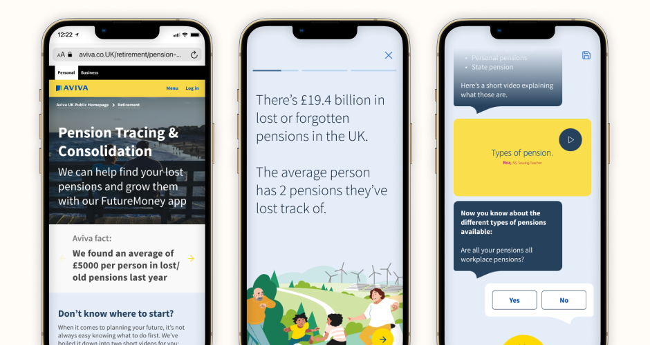
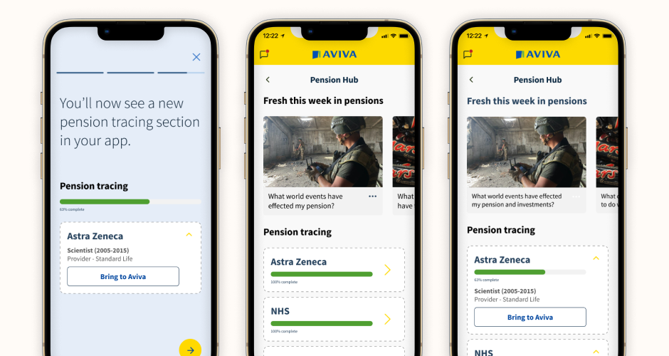
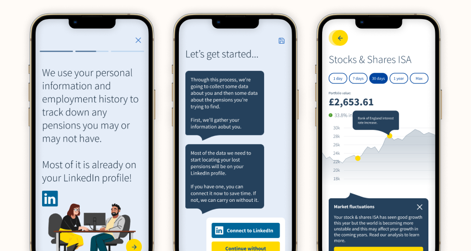
Aviva had a strong pension consolidation service but new competitors — Pension Bee and others — were taking share by making the experience feel simple, modern, and personal. The challenge was to leapfrog them by combining Aviva's genuine depth and personal touch with automation, using new datasets to remove the friction that was holding customers back.
Research told us that a 'little and often' communication style was what customers actually wanted — even when there was nothing new to report, they wanted to feel they were still on Aviva's radar. I used a chat UI to embody that — writing scripts that engaged users conversationally and kept the data capture to an absolute minimum upfront. The resulting app dashboard showed users exactly where Aviva was in tracking their pensions, with multiple states built out to show how the picture would build over time and what the low-level advice would look like for pensions that couldn't be brought across.
The proof of concept demonstrated a fundamentally different approach to pension consolidation — one where the technology felt like a service, not a form. It gave Aviva a clear direction for how to compete with challengers on experience, not just product.
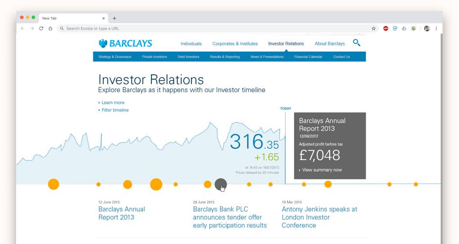
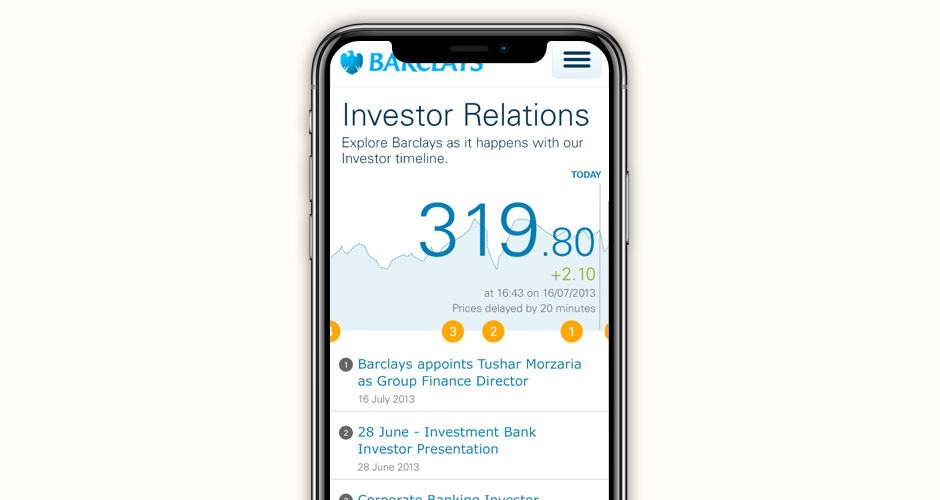
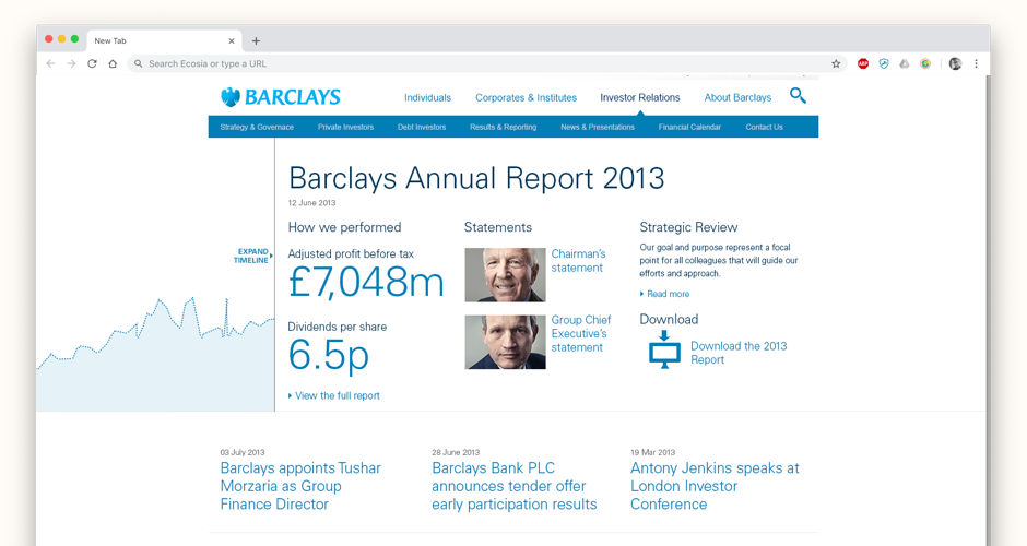
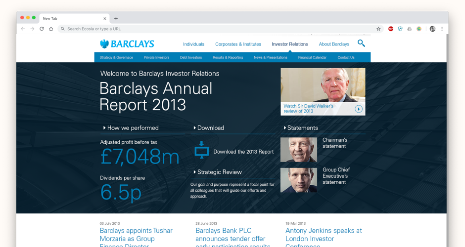
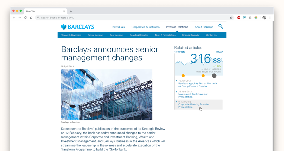
The existing Barclays investor relations site was dated, difficult to manage through the CMS, and offered little beyond standard press releases and share statistics. This was a pitch to reimagine the site as something that could genuinely engage both existing shareholders and prospective investors — making the data interesting rather than just accessible.
I developed a concept that placed the company's historical stock performance graph at the centre of the experience — not as a dry financial chart, but as a navigable timeline. At key moments of significant movement, press releases, strategic announcements, and internal events could be pinned to the graph, giving users immediate context for what drove peaks and troughs. This transformed a static data display into a story of the company's performance. Interactive homepage headers allowed users to dive deeper into specific moments, and the entire experience was designed responsively from the outset.
The concept demonstrated how investor relations content could be reimagined as genuine content — informative, engaging, and differentiated from the category convention of static tables and archived PDFs.
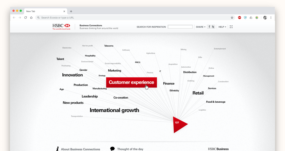
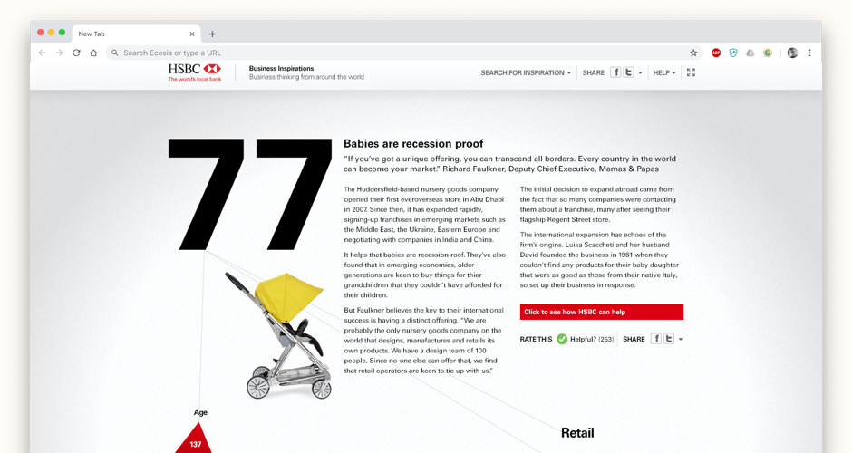
HSBC Business Connections was a respected print magazine that the bank wanted to bring into a scalable digital context. Simply digitising the magazine wasn't the brief — the goal was to find a digital interaction model that made the content more accessible and more engaging than print, while reflecting HSBC's brand values.
I designed an immersive experience built around exploratory navigation. Rather than a table of contents or category index, users moved through the content using descriptive tags — each choice narrowing or expanding what they saw, and each journey being tracked and used to inform the navigation itself. The UI was animated and content-forward, creating the sense of being inside a space rather than browsing a list. The design was executed closely within HSBC's digital brand guidelines, working in collaboration with the executive creative director.
A digital content experience that treated the reader as an explorer rather than a searcher — demonstrating how financial brands could create genuinely engaging content platforms beyond the convention of article libraries.
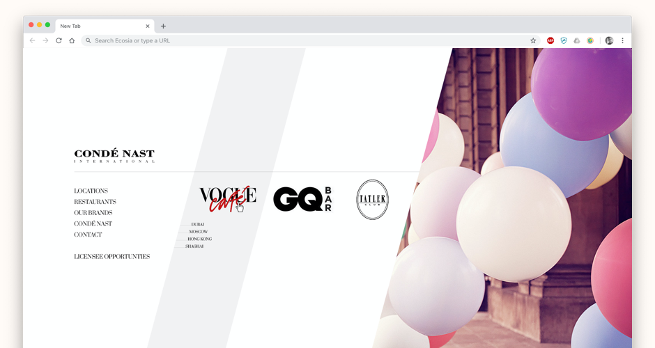
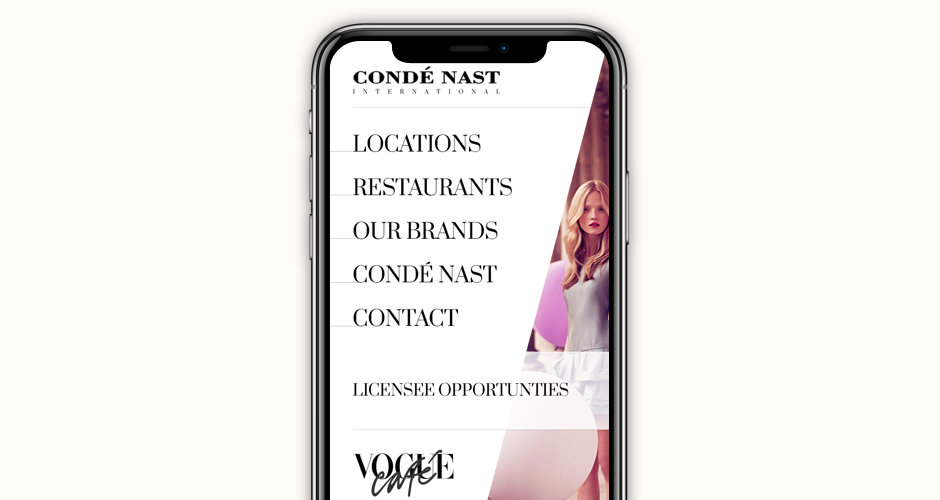
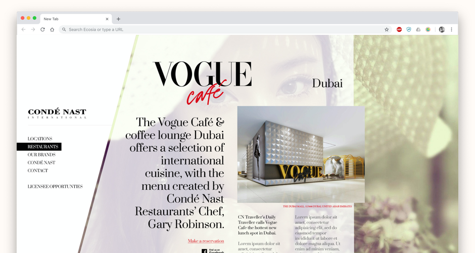
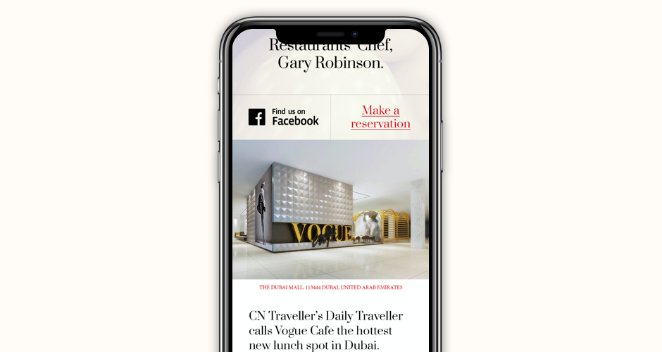
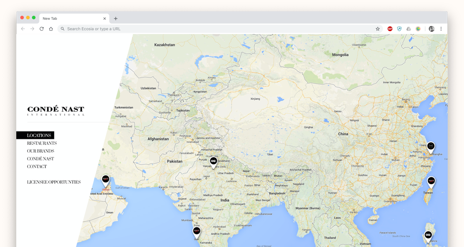
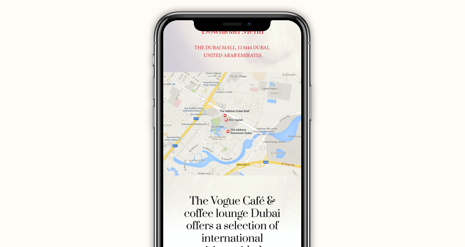
Condé Nast wanted to refresh their global digital presence to better reflect the prestige and breadth of their publication portfolio. The challenge was finding a visual language that could communicate the quality of brands like Vogue, Wired, and Vanity Fair without being tied to any one of them — and that would resonate across the genuinely global audience the group serves from their Hong Kong base.
Working with a global team, I led the UX and design to create a responsive experience that used bold shapes, dynamic layout, and strong typographic hierarchy to give the site an editorial feel online. The homepage especially departed from the standard corporate grid — using spatial composition more like a magazine spread than a web page, while remaining entirely functional and navigable. Every design decision was made with the quality and prestige of the Condé Nast brand family in mind.
A digital presence that finally matched the visual ambition of the publications it represented — elevating the corporate brand to sit credibly alongside the editorial brands it owned.
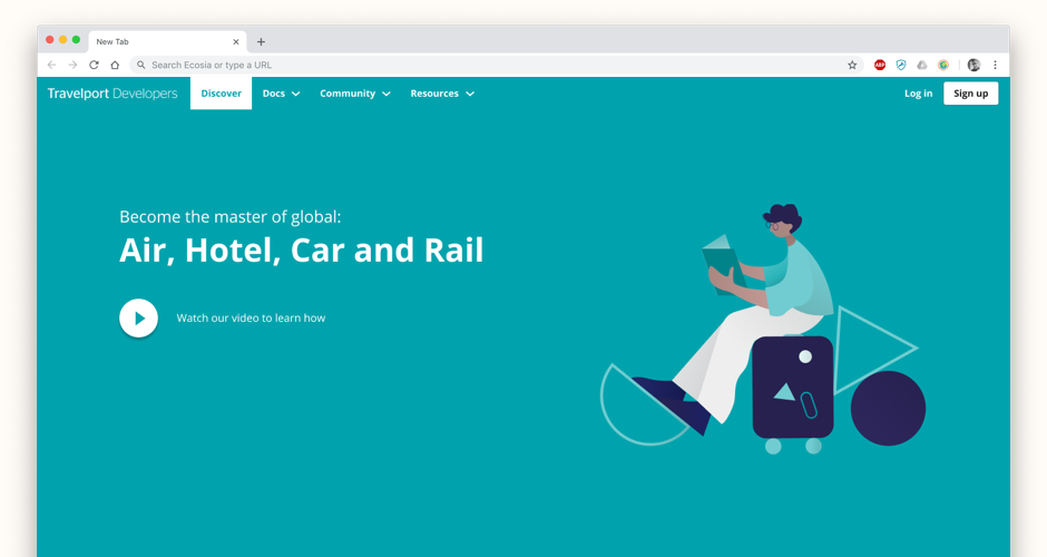
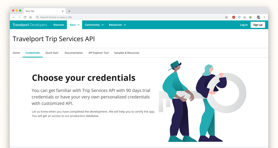
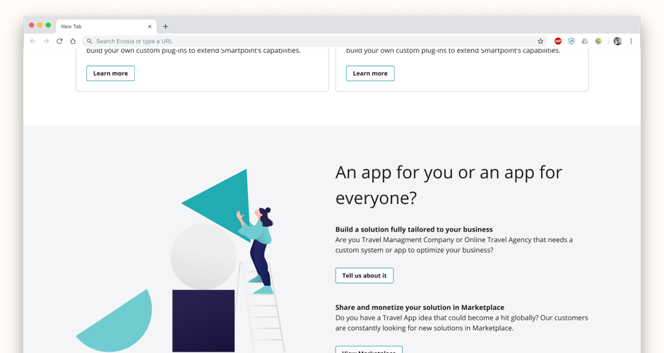
Travelport had a healthy developer community building apps for the Travelport Marketplace, but the developer experience was letting them down. Documentation was split across multiple locations, content was duplicated and hard to manage, and the overall feel was well behind modern SaaS developer portals. Travelport needed to compete with the likes of Stripe and Spotify for developer attention and loyalty.
A Helsinki-based in-house UX designer had already produced a detailed UX prototype of the key screens. My role was to take that UX and translate it into a high-quality UI using the Atlas design system, working in close daily collaboration with the Dublin-based Atlas team to evolve the system as needed. Because this was one of the few products users would actually see before logging in, it needed its own identity within the Travelport family — achieved through bold full-width components, alternating colour sections, and a bespoke illustration style developed in conjunction with the Atlas team. Every design decision was reviewed weekly with the wider stakeholder group and then handed to offshore developers in enough detail that nothing was lost in translation.
The Developer Experience went from fragmented and dated to a coherent, modern portal that felt credible to the developer audience it was designed for — with a system foundation that made ongoing content management significantly easier.
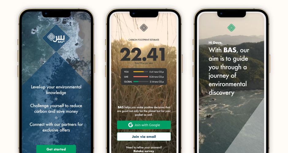
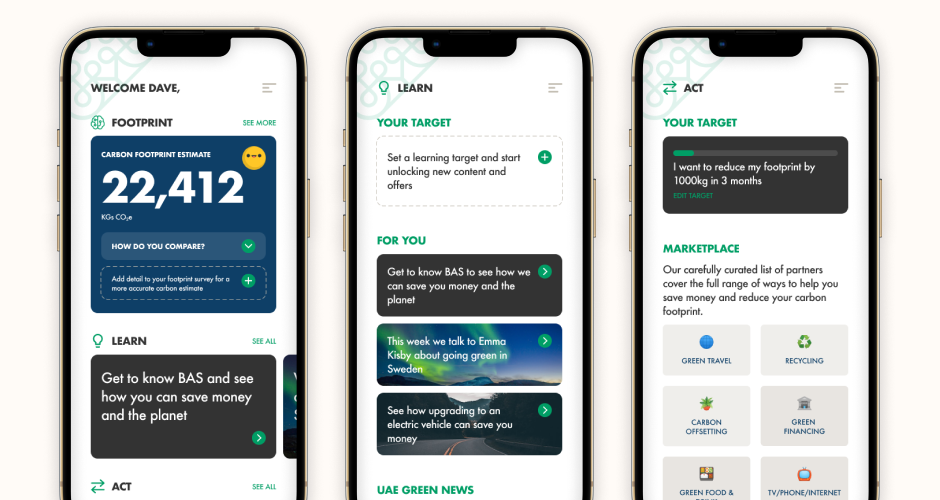
With COP28 hosted by the UAE, First Abu Dhabi Bank wanted to capitalise on growing carbon awareness — but research revealed a significant problem. Very few people in the region cared about their carbon footprint, and those who did felt powerless to act given the lack of green infrastructure. The brief was to design an app that could bring people from knowing nothing to genuinely caring and acting — without being preachy or patronising.
I designed an app experience that led with shock before settling into guidance. Gamification mechanics were used to create an initial moment of confrontation with the user's actual carbon impact — something hard to ignore. From there, a structured journey moved users through education, personalised data insight, and action via a green partner marketplace. The experience was designed for high app-usage habits in the region, and every stage was calibrated to keep users moving forward rather than bouncing out.
The proof of concept was positively received by FAB stakeholders and customer testers, validating the persuasion model and the UX approach. The project established a framework the bank intended to develop further for international markets.
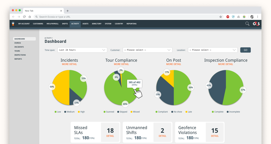
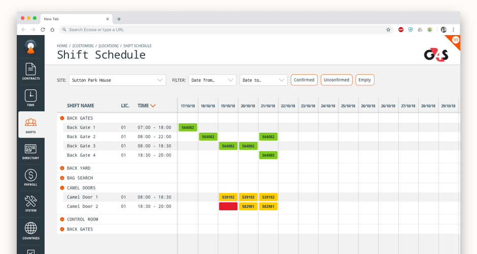
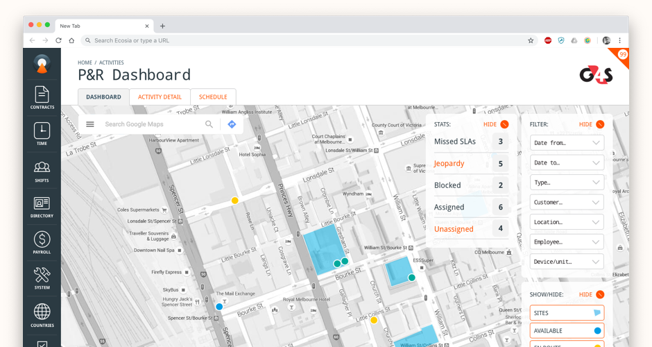
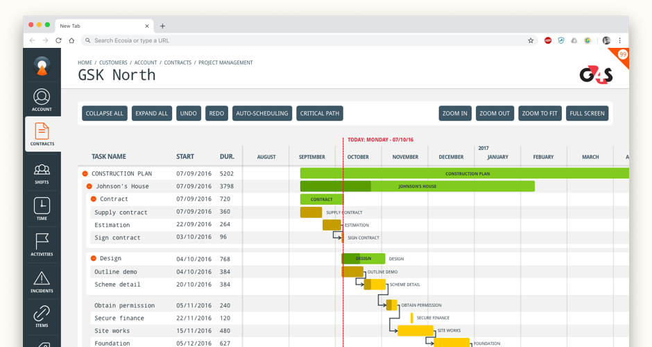
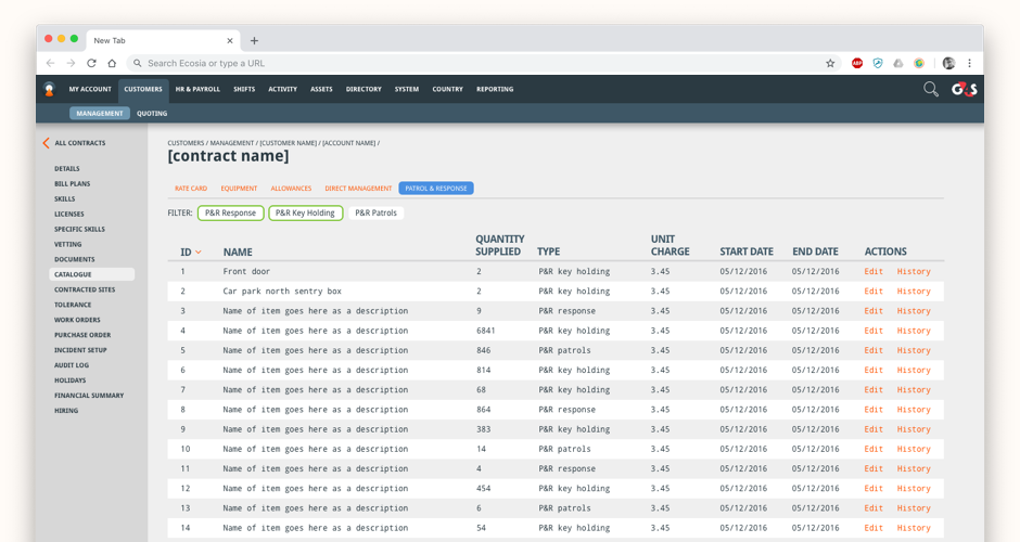
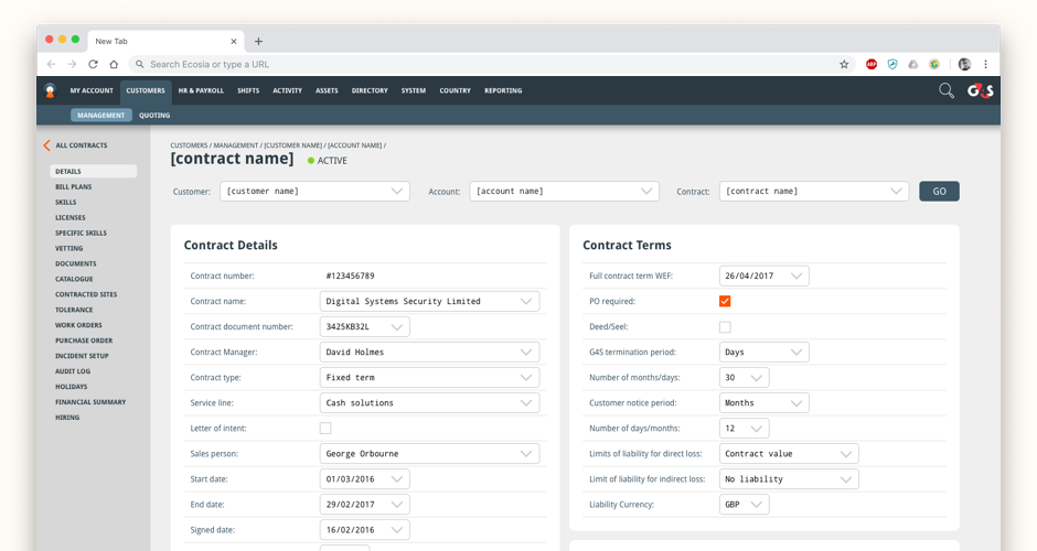
G4S had grown rapidly through acquisition, and each country was running its own systems — from Excel spreadsheets to bespoke enterprise software. The result was an organisation that couldn't be managed globally: tasks could only be done by local employees with local knowledge of local tools. There was a clear need to consolidate everything under a single digital platform — HR management, project management, staff geo-tracking — built from scratch, with no existing design system to start from.
I came in as the sole design resource, taking over from where a team of 50+ had left off, and built a design system grounded in genuine UX thinking rather than inherited decisions. The system's visual language deliberately departed from G4S's red, black, and white brand palette — because users would be staring at these screens all day in long shifts and darker rooms. I moved to a suite of greys and blues calibrated for eye comfort, with orange used exclusively for interaction points. Every product — dashboards, tables, forms, geo-tracking interfaces — was built around the idea that visual structure should do the work that keyboards and text fields were previously doing. Deep navigation was redesigned to be context-driven and accessible without dominating the screen.
A coherent, scalable design system and a suite of enterprise products that frontline staff could use effectively across G4S's global operations — built lean, validated with users, and designed for the actual working conditions of the people using them.
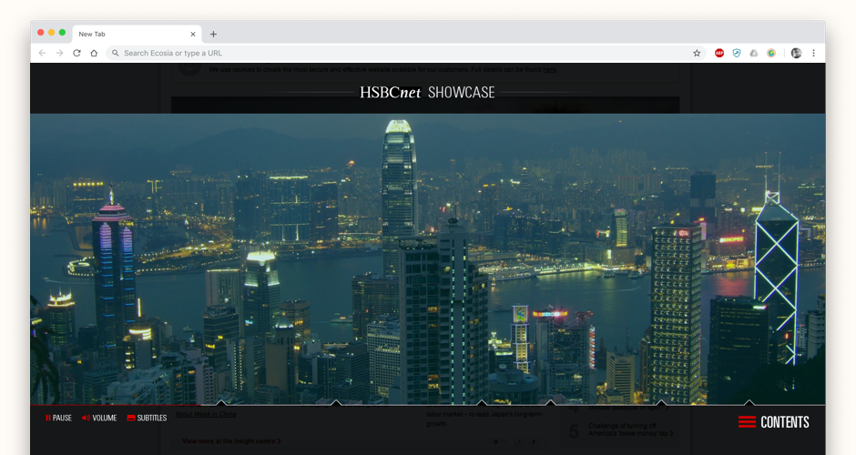
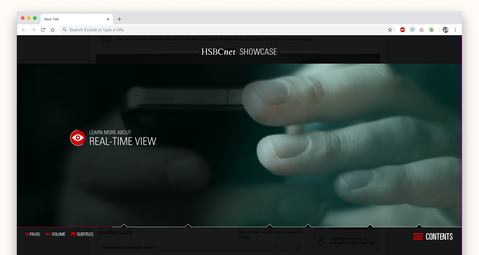
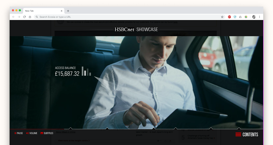
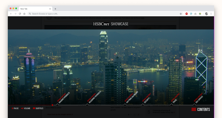
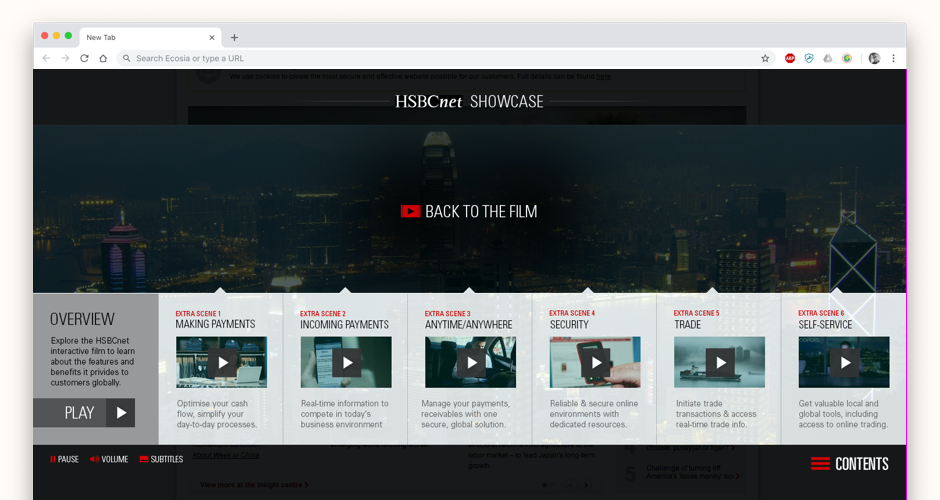
HSBCnet — HSBC's online business banking platform — had a product explainer video that wasn't converting. It was tired, passive, and failed to communicate the depth of the product to the range of users who needed it, from small businesses to large corporates. The opportunity was to think beyond video entirely.
I developed and UX-ed a concept for an interactive film — a full-screen narrative experience that walked users through HSBCnet's features through an acted storyline, with branching sub-films available at key moments for users who wanted to go deeper on specific features. The user was positioned at the centre of the story rather than as a passive viewer, and the depth of content available at each branch point made the experience equally useful for a sole trader and a finance director. I led the third-party film production team alongside the UX and design work.
Engagement with the product explainer increased significantly, and lead generation from the page improved markedly — demonstrating that a product story told through the right medium converts far more effectively than a conventional explainer video.
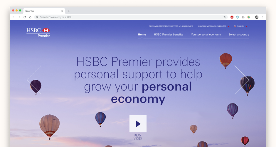
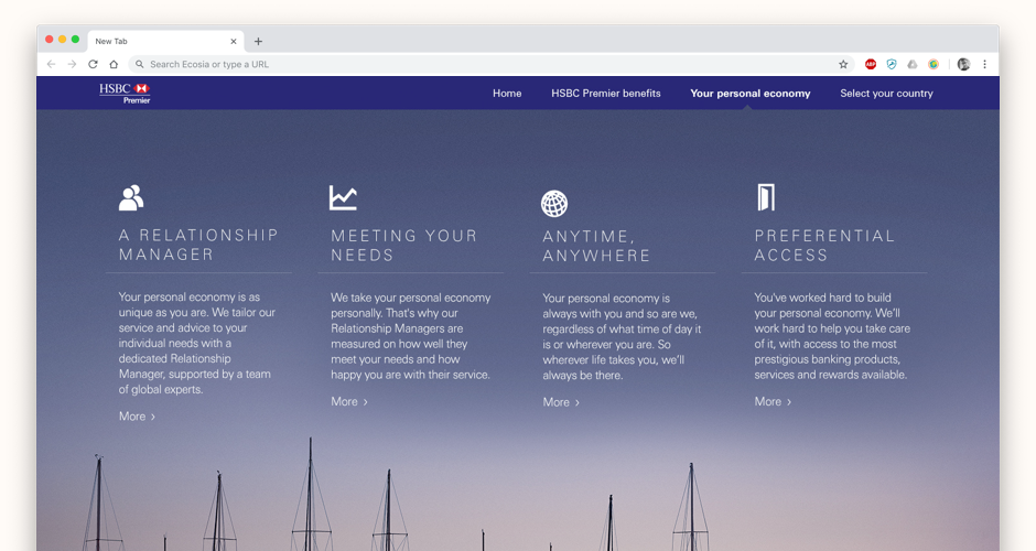
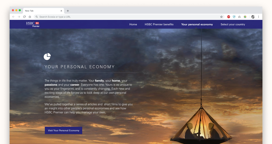
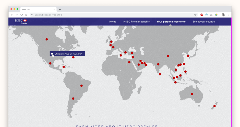
HSBC's wealth proposition had rebranded globally and needed a new public-facing website fast — in just five weeks. The site needed to reflect the premium positioning of HSBC Premier, introduce the brand's 'personal economy' marketing theme, and route a global audience to the right local market experience.
I designed the user experience and visual direction from scratch for both global and local pages, prioritising impact over complexity given the timeline. A parallax approach based on HSBC Premier's premium brand photography delivered the visual quality the rebrand demanded without requiring an extended development build. The site told the 'personal economy' story in a sequenced, scroll-driven narrative before presenting the user with their regional filter — ensuring every visitor understood the brand proposition before being routed onward.
A global premium banking website delivered in five weeks — hitting the rebrand deadline, establishing the new visual language, and creating a filterable path to 40+ local market sites.
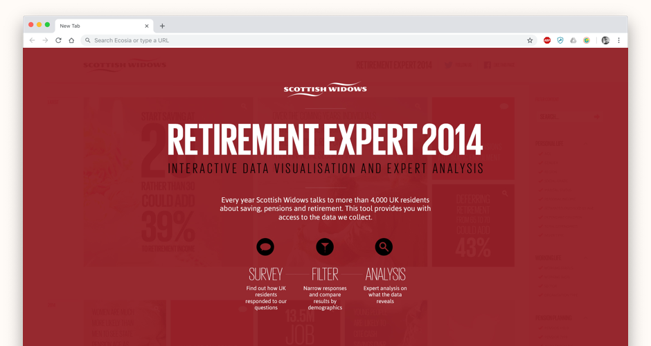
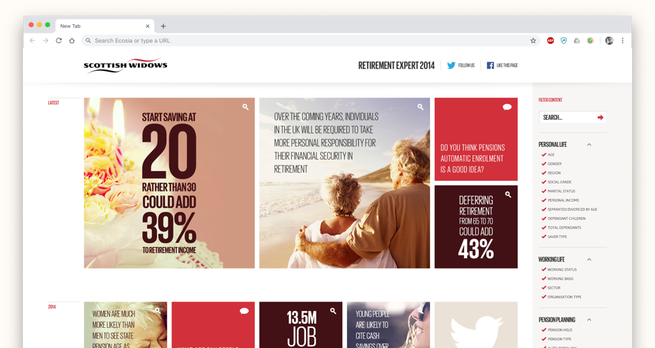
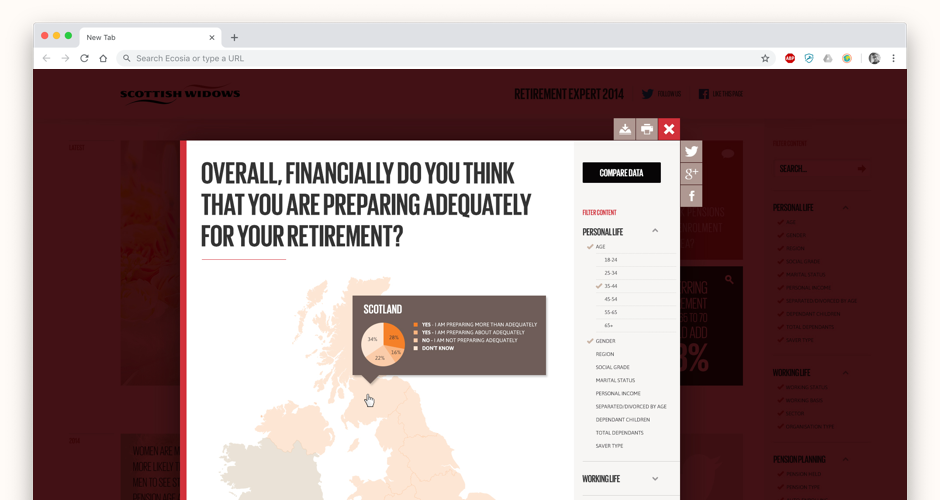
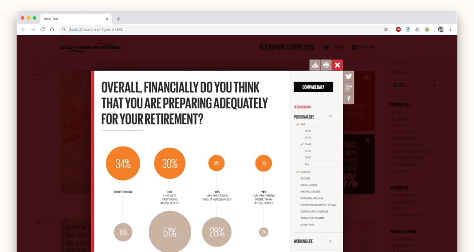
Scottish Widows had a significant body of research, data, and editorial content around retirement — but no credible way to publish it at scale. The content was sitting underused, and there was a clear opportunity to both increase awareness of retirement issues among younger audiences and use the content platform to introduce Scottish Widows' products at relevant moments in the user journey.
I designed a filterable content library built on an organic, configurable grid. Colour-coded and style-coded content modules allowed users to scan quickly for the type of content they wanted, while a comprehensive filter panel let them narrow by topic, audience, or theme. The grid itself was designed to be shaped by editorial teams — weighting certain pieces, creating visual hierarchy, and giving the platform a curated feel rather than an algorithmic one. The design created a natural path from educational content consumption to product consideration.
Scottish Widows had a living content platform that their editorial team could manage and evolve — and a credible digital presence in the retirement education space that brought their research to a much wider audience.
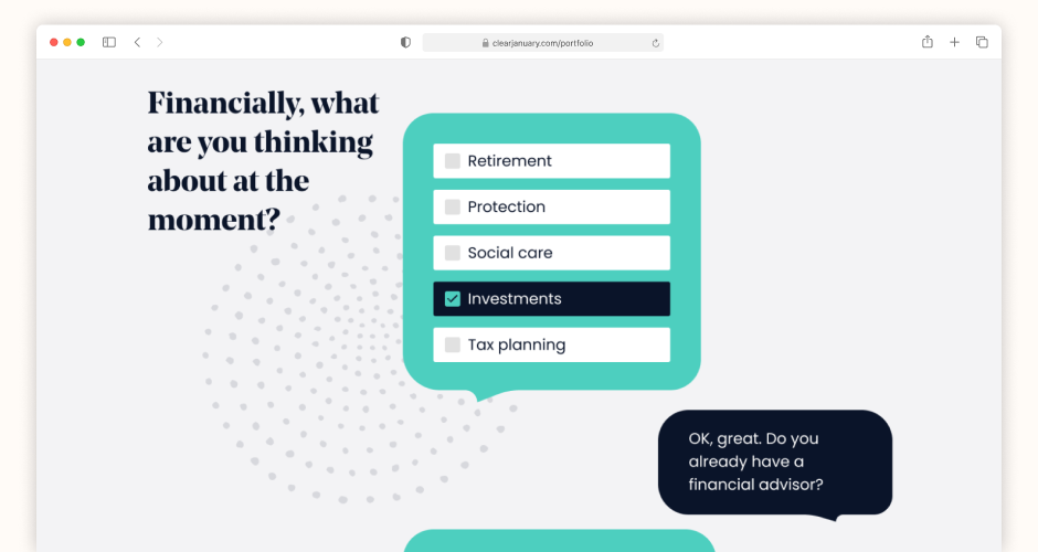
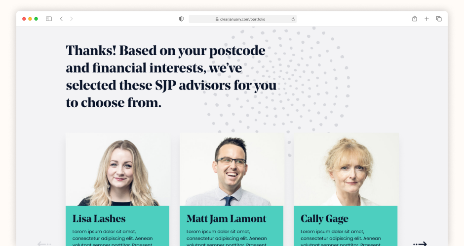
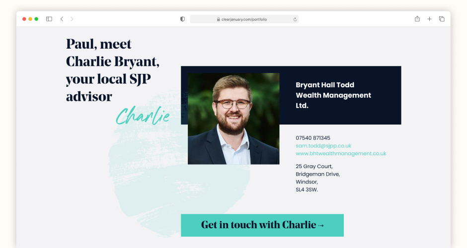
St. James's Place were going through a rebrand, and with it came a structural problem: they were passing unqualified leads to partner advisors across the region. Advisors had almost no information about the person before making contact, which hurt conversion and wasted time on both sides. At the same time, SJP needed to extend their tone of voice — warm, human, personal — into a digital context where it had previously been absent.
I designed a chat UI that lived within the new website and could surface contextually anywhere across the user journey. The scripts I wrote asked about financial feelings and future goals using quick-fire multiple choice to keep engagement high — but the underlying data model was building a deep profile with every answer. Location, life stage, financial attitude, product interest, and future planning intent were all captured and passed to the appropriate partner advisor. Advisors went from receiving a name and email address to receiving a fully profiled, qualified lead.
The gap between an unqualified lead and a profiled prospect is significant in terms of conversion likelihood. SJP now had a digital mechanism to close that gap at scale — and a tone of voice that extended consistently from the brand into the product.
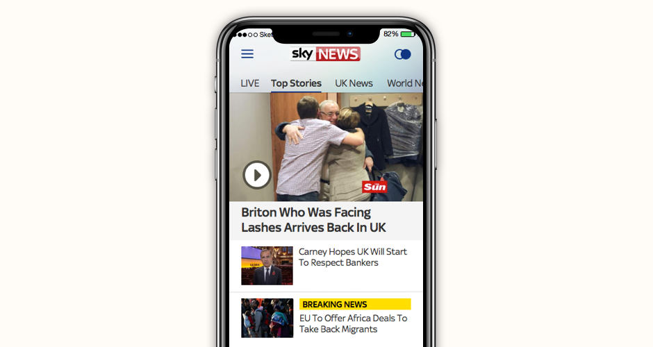
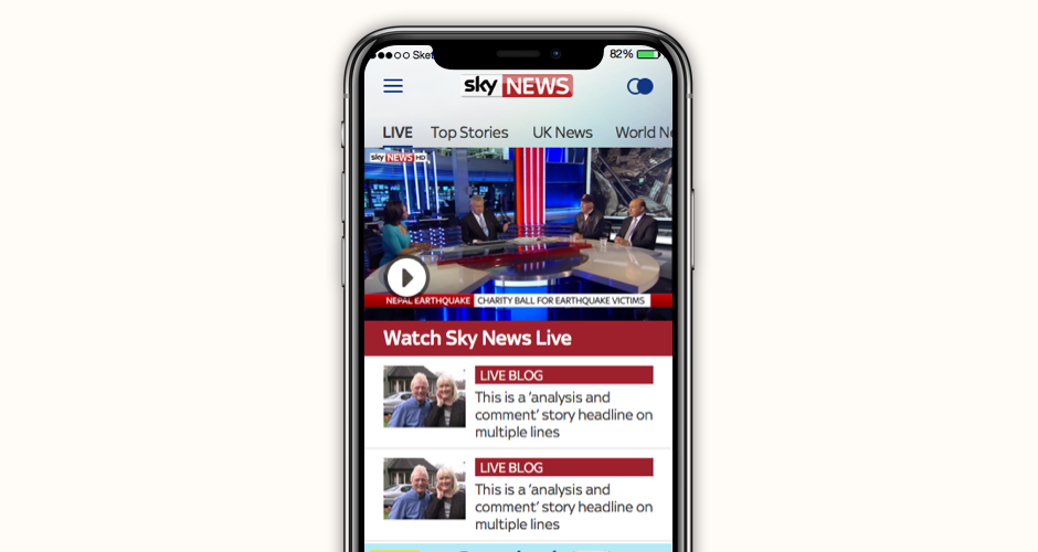
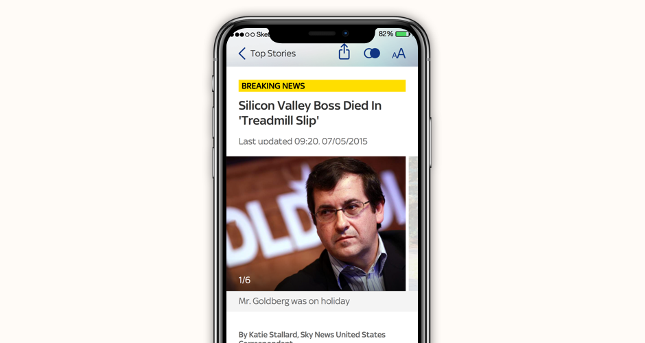
The Sky News mobile apps needed updating for two converging reasons: a new studio set and brand refresh following the 2015 general election, and an upcoming iOS version that the existing app wouldn't survive. Sky wanted to do more than patch the apps — they wanted to establish an ongoing, user-centred design practice that would drive the roadmap beyond this initial refresh.
I led the art direction across both platforms at the start of an agile product development roadmap, establishing the visual language and interaction principles before moving into feature work using the Design Sprint methodology. Each sprint began with user and competitor research, moved through structured ideation and prototyping, and ended with validated concepts ready to build. Video was given a more prominent role in the redesigned experience, and a new live interaction feature was introduced as a direct result of the sprint process. Once the MDP was defined and validated, I handed the process, design, and code to a new team in Leeds with everything they needed to continue.
A refreshed, validated app experience delivered on time for the iOS release deadline — and a design process that outlasted the initial project, giving Sky News a repeatable method for user-centred feature development.
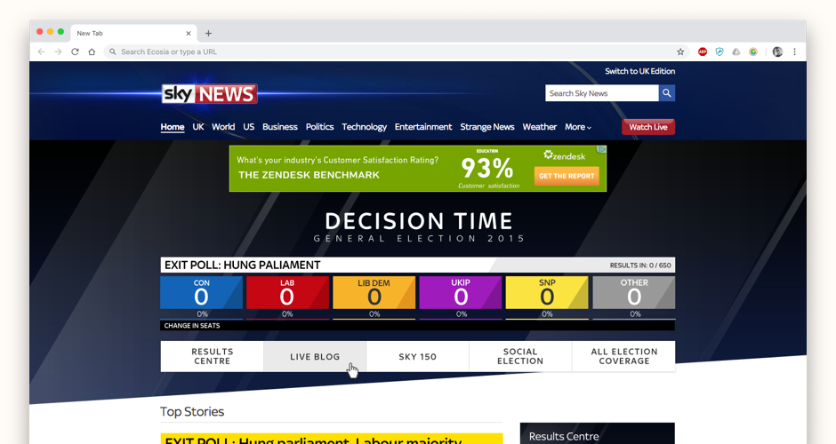
With the UK General Election six months away, Sky News wanted to make the most of its data, expert insight, and broadcasting reach to create a digital experience that would drive traffic, increase advertising revenue, and help produce better-informed voters. The challenge was to design something that sat alongside the TV experience without duplicating it — offering genuine depth and interactivity rather than a second screen afterthought.
I designed a persistent election layer that sat at the top of every Sky News page, making the election unmissable regardless of what brought users to the site. The layer contained a live blog with real-time commentary on what was happening and why, a swing county prediction tool showing which seats would change hands and what that meant for the result, and a social media impact tracker. The design kept Sky News' trademark simplicity while giving politically engaged users the depth they wanted to explore. The responsive design worked across desktop and the app, creating a genuinely cross-platform election experience.
Sky News' election coverage outperformed every other news outlet in terms of viewership — digital and broadcast together — and won multiple industry awards. The design proved that data-rich political content could be made genuinely compelling for a mainstream audience.
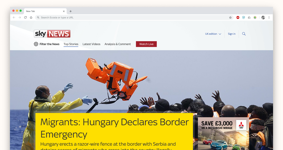
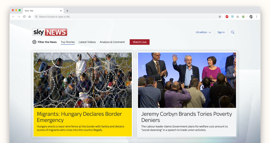
A new Sky-wide design system had been released centrally and needed to be implemented across the product estate. The Sky News website was around five years old and starting to feel inconsistent with the rest of the Sky product family. But Sky News also had its own brand considerations and revenue model — any refresh needed to honour those while modernising the experience.
I used the new design system as a foundation and designed a concept that finally used the full browser width rather than a fixed-width column — unlocking the visual potential of Sky News' photographic and video archive. Page templates and component layouts were designed to balance advertising slots and editorial flexibility, with personalised content placement built into the structure. The result felt contemporary and aligned with the wider Sky family while retaining the editorial authority that Sky News users expected.
A modern, system-aligned concept that gave Sky News a credible path forward — one that respected the editorial nature of the brand while bringing the site into line with the design standards the rest of the Sky estate was moving toward.
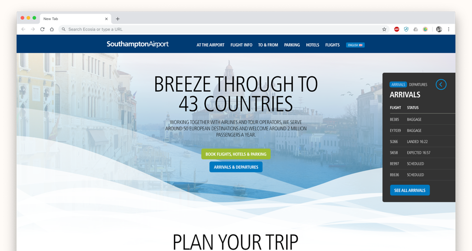
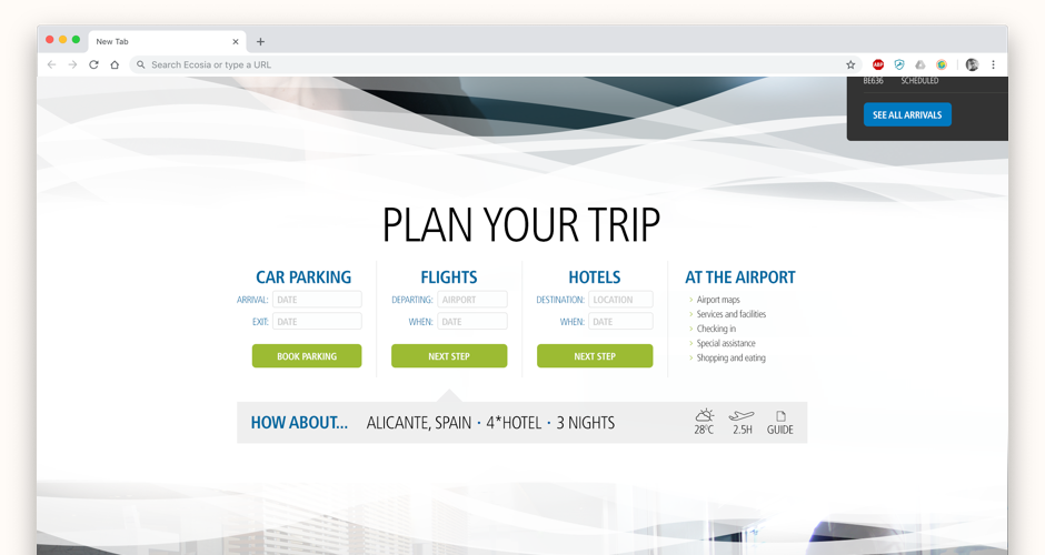
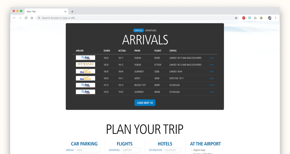
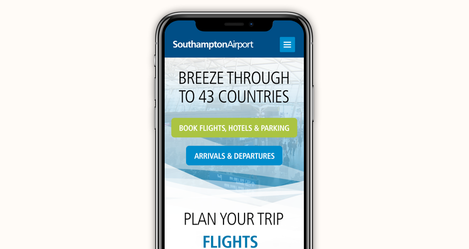
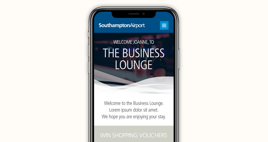
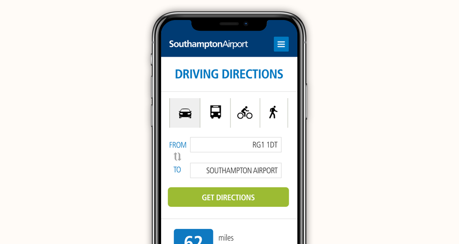
Southampton Airport knew from its data that a significant proportion of its passengers were business travellers — a group who found the airport experience unnecessarily stressful given how familiar and routine flying was for them. The airport wanted to better serve this audience digitally, using the devices that were already part of every business traveller's life.
I designed the on-the-day experience end-to-end as a service design challenge — starting from the moment the user woke up at home. The app knew where the user lived and what time their flight was, and it woke them with enough time to get to the airport comfortably, with a customisable buffer. When the user arrived at Southampton Airport and connected to the airport WiFi, the app detected their presence and shifted mode — guiding them to the lounge, shopping areas, or gate depending on how much time was available. As the gate deadline approached, AR and GPS took over to navigate the user directly to the right gate, before handing off with a 'relax and enjoy your flight' moment once they'd boarded.
A proof of concept that reimagined the regional airport experience as a proactive, intelligent service — and gave Southampton Airport a compelling vision for how technology could genuinely improve the experience of its highest-value passengers.
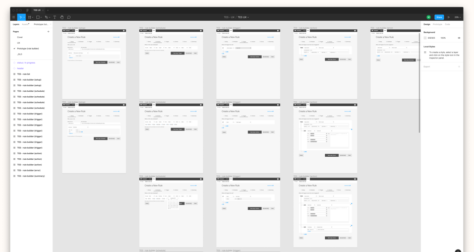
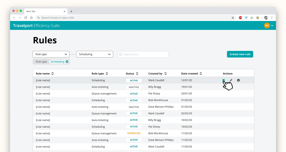
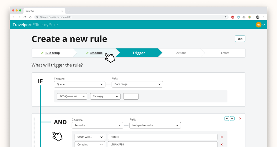
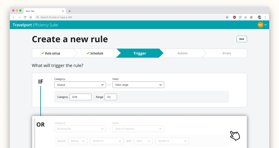
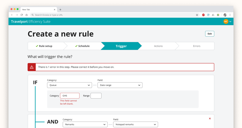
Travelport's SaaS product offering was falling behind its two main competitors. The Efficiency Suite — which housed a collection of rule-builder tools — was inconsistent across products, underinvested, and fragmented: multiple products were doing similar jobs in different ways. The goal was to consolidate them into a single coherent platform without losing the specific functionality each product's users relied on.
The first stage was a cross-discipline workshop with stakeholders to map every feature across the existing rule builders — what was common, what was unique, and what order to tackle things in. Competitor and market analysis revealed that the best rule builders used an 'if this, then that' logic model, which became the foundation for the prototype. Journey mapping with existing alpha users surfaced the emotional reality of using the current tools alongside the functional gaps. I built a stepped rule creation prototype in Figma and validated it directly with users and product owners before moving to UI. Because I'd been part of an earlier Atlas design system project, I was able to build and document the custom components we needed quickly.
The project produced a validated UX prototype, a complete UI built on the Atlas design system, and a documented component set ready for development — a solid, scalable platform for Travelport's rule-building tools to evolve from.
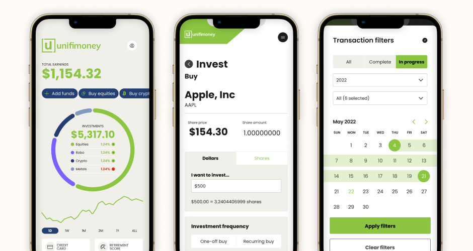
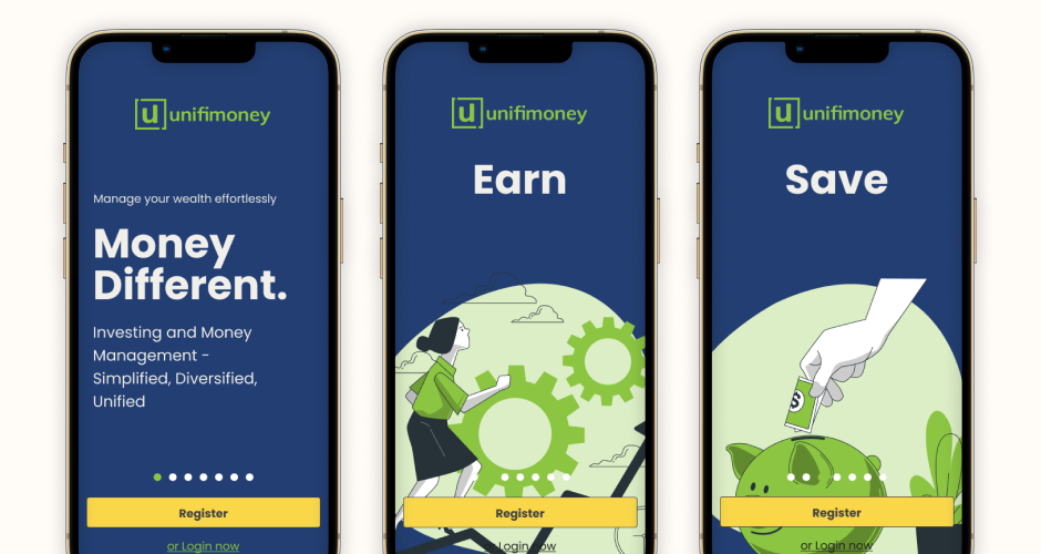
Unifimoney was a San Francisco fintech startup with an ambitious premise — unify all your money into one app. Their initial designer was moving on just as the MVP was gaining real users, and the gap left was significant: the design system needed an overhaul, the UX had issues that only became visible once real people were using it, and the offshore development team needed a design partner embedded in their sprint rhythm.
I stepped in as the de facto product design team — owning all UX and UI output across every sprint. My first move was to audit the existing design system and rebuild it properly, then establish a working practice with the development team that made design a first-class part of the sprint rather than an afterthought. From there, each sprint cycled between user research to identify what needed to change, design to define how, and close collaboration with developers to make sure what shipped matched what was designed. The product grew significantly in feature depth and platform reach over the two years.
Unifimoney went from an MVP with structural UX issues to a coherent, feature-rich product with a scalable design system behind it — delivered consistently and without a traditional in-house design team.

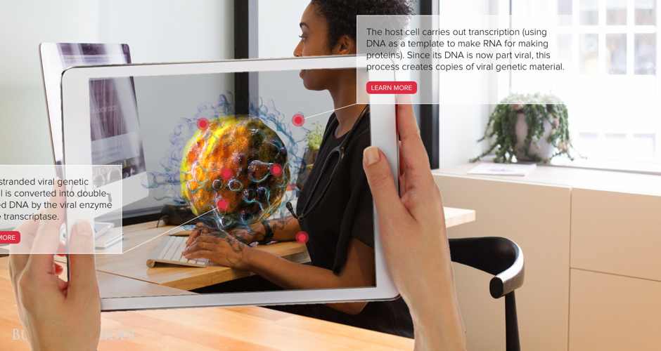
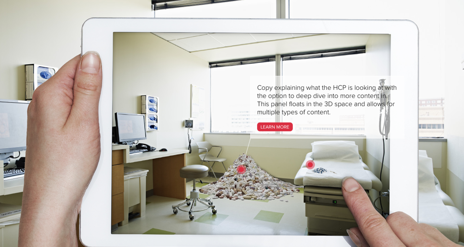
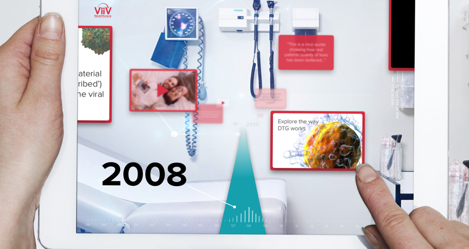
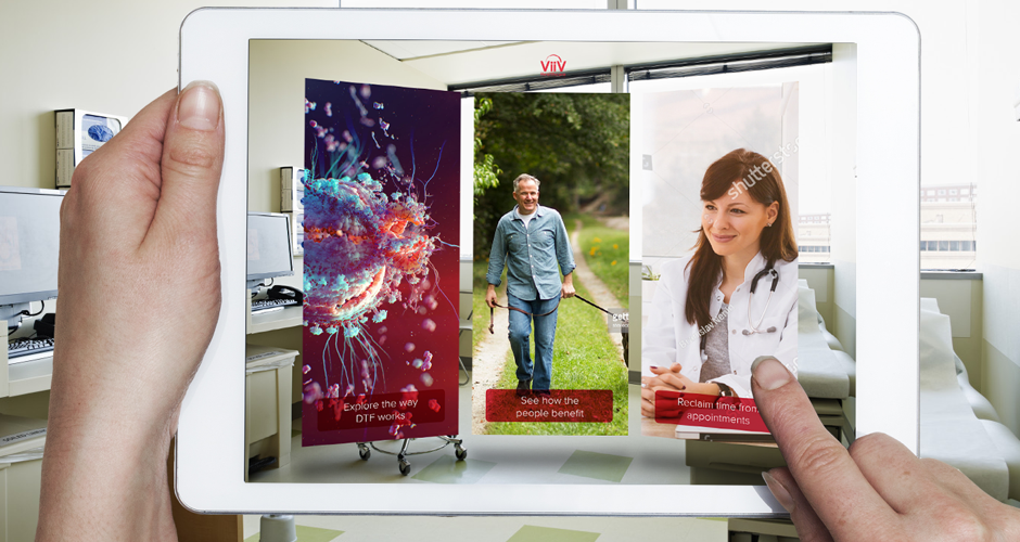
Healthcare professionals are notoriously time-poor, and pharmaceutical sales teams needed tools that could capture attention and communicate complex drug information quickly and effectively — whether in a busy conference or a brief visit to a GP surgery. The existing materials weren't engaging enough for the increasingly high bar HCPs set for how they wanted to receive information.
Working as sole UX/UI designer, I designed an iPad app that used augmented reality to let HCPs explore drug content spatially — moving between articles, interactive modes of action, and supporting data in a way that felt exploratory rather than prescriptive. Because each HCP has different specialisms and areas of interest, the tool was designed to allow access from any direction rather than forcing a linear journey. The AR layer added visual impact and memorability without sacrificing legibility across the different environments sales teams operate in.
The tool gave sales teams a significantly more engaging way to start and deepen conversations with HCPs — moving from a one-way information transfer to an interactive dialogue shaped by the HCP's own interests.
