Connecting Data
- concepts
- ux design
- ui design
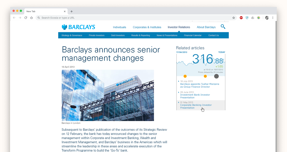
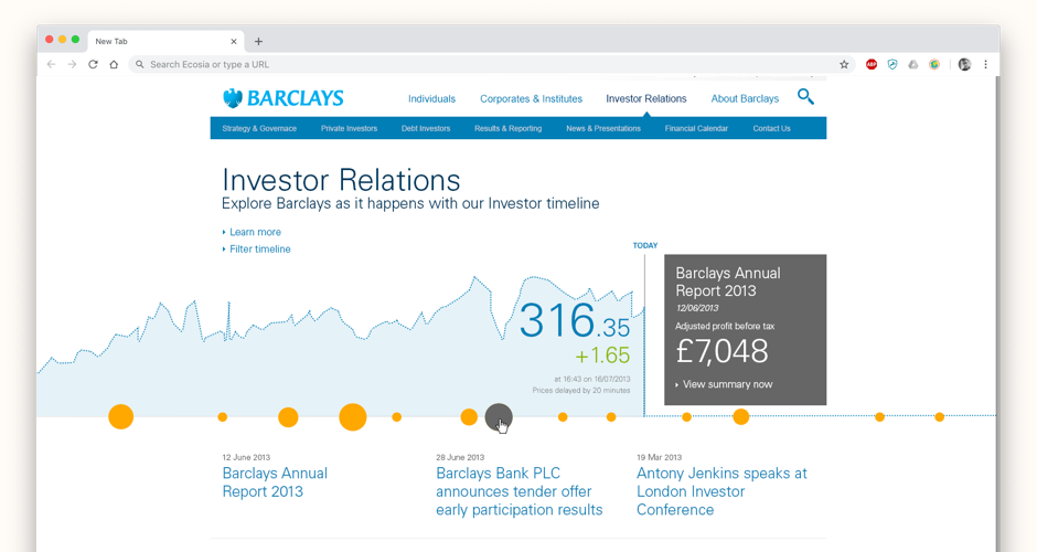 We brought the share price to life and mapped it against company and world news
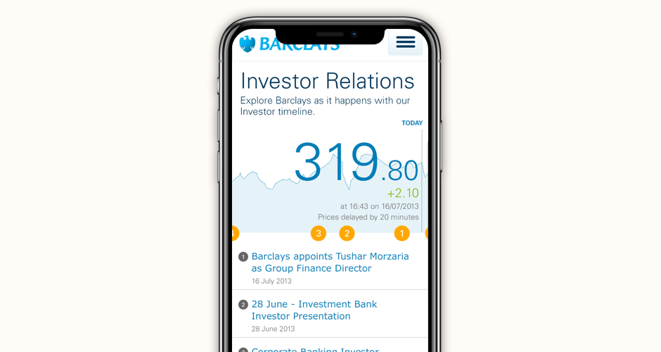 The project was responsive from the outset
 The homepage interactive header allowed for deeper dives into content
 The homepage interactive header space could be used many ways
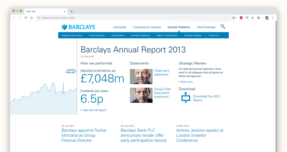
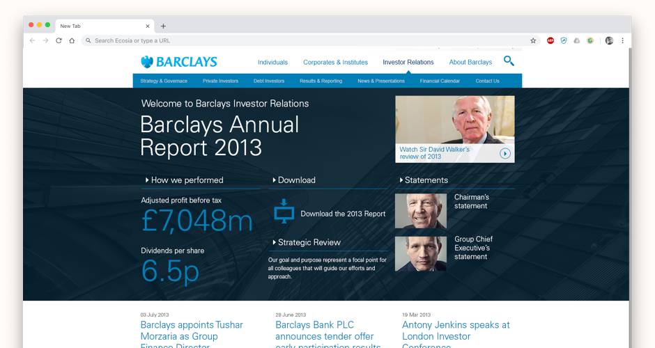
 Deeper level page templates allowed for more content with always a nod back to the share price
Business Problem
The current investor relations website for Barclays was getting very tired after a number of years live and was becoming difficult to manage through the internal CMS. This was a pitch to overhaul the existing site focussing on making information for existing and potential share holders more accessible.
Approach
Seeing a number of possibilities within the data and research available we wanted to create an investor relations website that would genuinely offer some interest and insight over and above the usual press releases and share stats.
Solution
I developed a concept that used the company stock performance graph as a way to house and help explain the peaks, troughs and overall performance of the banks shares. At key moments, press releases, news and internal events could be mapped to the graph to get a sense of why things were happening to the share price whilst seeing overall trend. My role was to UX and craft the idea so that it would really engage the user as well as design the screens using Barclays style guides.